¶ Introduction
When trying to solve a problem that involves calculating a specific, continuous value (IE: house values, test score, etc), this would be a linear regression type of problem. If the problem to be solved is determining the probability of an event occurring (true or false) or the probability of an object fitting into a certain class, this may be more suited for logistic regression.
There is sometimes a grey-line between logistic regression and classification problems in some cases since logistic regression problems determine a percentage to fit into a the class. A percentage is a continuous value but determines true/false or whether something fits into a specific class based on these percentages. This makes it sort of a regression problem but also allows other methods/tools to solve these. Tree-based methods such as Random Forest or Decision-Tree can be used for classification problems. To make things a little more confusing, there are ways to use tree-based methods to solve regression problems (but this isn't as common).
Lastly, there are clustering methods such as K-Means or K-Nearest Neighbors which are typically unsupervised methods meaning there is no Y-variable to determine. In these cases, the data scientist is only looking to find the best groupings. These methods are used in cases such as market-segmentation (grouping certain types of customers together).
We will now get into some more basic information on each of these.
¶ Linear Regression
In regards to linear regression, this section will start with a simple example which is one or two dimensional. From there, more variables will be added to the dataset to gradually enhance your learning. As the examples get more complex, this will introduce new tooling that can be used to tackle these more difficult problems.
¶ 2-Dimensional
The Full-Code for this exercise is located at
https://github.com/kcalliga/mydatasciencebook/blob/main/Chapter2/LinearRegression.ipynb
A linear regression type of problem typically involves trying to determine a numeric variable (Y) based on a single feature or multiple features (X variables).
Going back to the days of high school Algebra, there is the following formula
Y = Mx + BM is the coefficient which gets multiplied by the single value of X and added to the Y intercept (B) to get the target variable, Y.
Let's take a simple example with one feature (X variable) to determine Y.
This example is used a lot but I think it is very easy to understand.
Let's say multiple students take a test and we would like to estimate based on the total hours of study, the score that a student would get on the test.
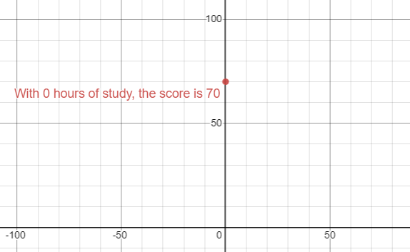
On the Y-axis, I will plot the Y intercept which is the test score that one would get if they didn't study at all (X is 0 hours). 70% will be used in this example.
This is essentially making the coefficient (M) zero which means that Y is equal to 70 which is also the Y intercept (B).
Y = (0)x + B
70 = 0 + 70Since the Y-intercept (B) is 70, this is the point on the Y axis, when X (hours of study) is 0.
To continue with this simple example, let's add an additional point to this graph. This point will be the second test-taker. Let's say that this student studied six hours and received a score of 80%.
The coefficient in this case will be the slope (rise over run) which gets multiplied by the value of X (6). The rise is the difference between the 70 received when studying 0 hours and 80 which are both on the Y axis (10). The run is the difference between 0 on the X-axis and 6 which is the hours of study (6). Y would be 80 which is the score the test-taker would get based on this.
Here is the breakdown
Y = (10/6)x + 70
Y = (10/6 * 6) + 70
Y = (1 ⅔ * 6) + 70
80 = 10 + 70Let's take this example and use it within a Jupyter Notebook.
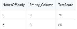
A CSV file has been created for this purpose and looks as follows. The Empty_Column field has been added in order to allow the model.fit to run. The dataset needs to have 2-D data. The zeros in this column add no computational changes.
This file can be downloaded from
https://github.com/kcalliga/mydatasciencebook/blob/main/Chapter2/LinearRegression1,csv
Here is the code
import numpy as np
import pandas as pd
# Import libraries to do linear regression
from sklearn.linear_model import LinearRegression
# Import Pyplot for plotting
import matplotlib.pyplot as plt
# Read CSV file as dataframe called data
data = pd.read_csv("LinearRegression1.csv")
# View the rows and columns
data
# Split data into X and Y
X = data.drop("TestScore", axis=1)
y = data["TestScore"]
# Show Line Plot
plt.plot(X, y)
plt.show()
# Create the regression model to solve this
# Create the regression model to solve this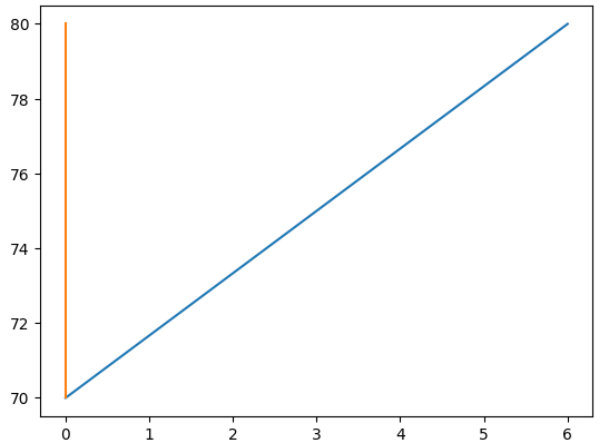
model = LinearRegression().fit(X, y)The following diagram shows the line plot for these two points.
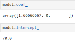
From the manual calculations we have performed thus far, we know that the formula to solve this simple linear regression problem is Y = 1 ⅔ (X) + 70.
Let's look at the coefficient that is figured out from Python and the intercept. We already know this information from the manual calculations but it is useful to see the code as well
model.coef_
model_intercept_
The next CSV file will only contain the X variables that were used in the fit that was run earlier. Y is not present because it will need to be calculated using predict.
This file can be downloaded from
https://github.com/kcalliga/mydatasciencebook/tree/main/Chapter2/LinearRegression2.csv
Let's now use the model that was built to do a prediction on the data above
X_new = pd.read_csv("LinearRegression2.csv")
model.predict(X_new)Here are the results of this prediction
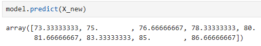
If we match up the hours of study with the predictions here, this is how it would look
| Hours_Of_Study | TestScore |
| 2 | 73.33 |
| 3 | 75 |
| 4 | 76.6667 |
| 5 | 78.333 |
| 6 | 80 |
| 7 | 81.6667 |
| 8 | 83.3333 |
| 9 | 85 |
| 10 | 86.667 |
As you can see, the prediction for 6 hours of study lines up with the original data that we had which showed the test-taker received a score of 80%. Based on the limited information in this dataset, these predictions would not be used in the real-world since there was only two results in the original data that was used for training which only showed the person that studied 0 hours and received 70% score and then the 6 hours of study for the 80% score.
¶ Multi-Dimensional
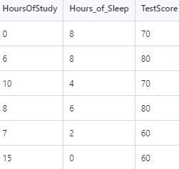
Let's add another X variable to our dataset. This variable will be hours of sleep on the night before the test. The idea is that less than 8 hours of sleep will contribute to a negative impact on the test-score and will have the opposite effect that study hours has.
The dataset for this part is at:
https://github.com/kcalliga/mydatasciencebook/blob/main/Chapter2/LinearRegression3.csv
Notice that I removed the Empty_Column field. This is due to the facthttps://github.com/kcalliga/mydatasciencebook/blob/main/Chapter2/linearregression3.csv that the Hours_Of_Sleep field has been added. I made the original entries the same and set them both to have 8 hours of sleep meaning that there is no change in the original scores (70 and 80 percent). Some new rows have been added which take into account some students who studied long hours but got little sleep. This will show a slight negative effect in the scores.
Let's do a fit on this new dataset so we can run a predict on test scores using the Hours_Of_Sleep variable.
# Split data into X and Y
X = X_new2.drop("TestScore", axis=1)
y = X_new2["TestScore"]
# Create the regression model for the 3d model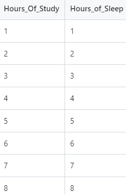
model_new2 = LinearRegression().fit(X, y)Here is the screenshot of the data that will be used for the prediction based on model2.
This data is located at:
https://github.com/kcalliga/mydatasciencebook/blob/main/Chapter2/LinearRegression4.csv
Here is the code to make the new predictions
# Load the dataset to be predicted with only Hours_Of_Study and Hours_Of_Sleep
model_new2_predict = pd.read_csv("LinearRegression4.csv")
model_new2.predict(model_new2_predict)
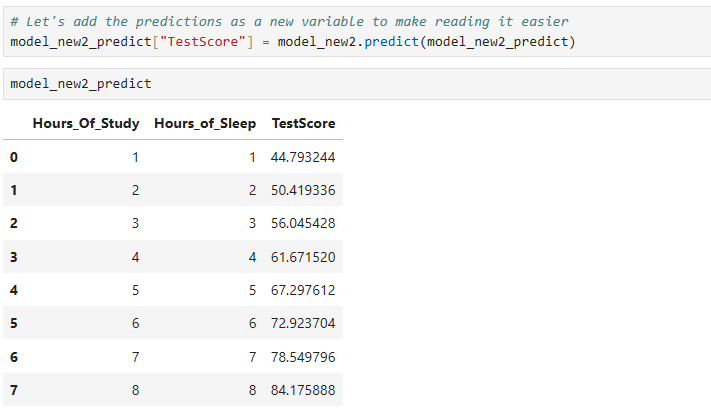
# Let's add the predictions as a new variable to make reading it easier
model_new2_predict["TestScore"] = model_new2.predict(model_new2_predict)
# Let's add the predictions as a new variable to make reading it easier
model_new2_predict["TestScore"] = model_new2.predict(model_new2_predict)
# Finally, let's view all of this in a nice chart
model_new2_predict
We will come back to this more a little later
¶ Polynomial Regression
The full-code for this exercise is located at
There are times when a relationship between X and Y variables is not strictly linear (IE: straight line). In these cases, a model may need to be built which has a better fit to the curvature of a Polynomial. In any regression model, it is important to minimize the loss (errors). More will be discussed in regards to this in the statistics section.
The dataset that will be used in this example is located at:
https://github.com/kcalliga/mydatasciencebook/blob/main/Chapter2/PolynomialRegression1.csv
And appears as follows
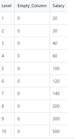
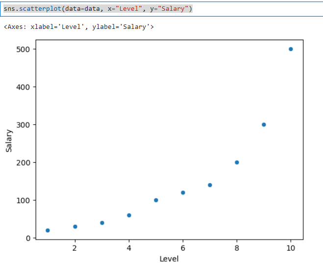
This fake data shows an employee's level as determined by human resources at a company and the related salary (in tens of thousands). As shown in the scatterplot below, this doesn't fit a straight line. As we did before, an empty column has been added since X would not be 2 dimensional (IE: it only contained the level variable).
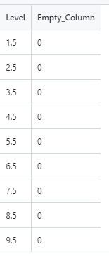
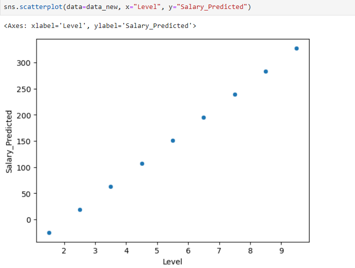
The values shown in this chart are discrete (whole numbers from one to ten). To stay within this range, I am going to do predictions against ½ increments of these levels starting with 1 ½ and going to 9 ½ as shown below.
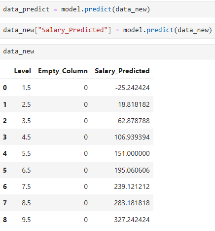
Based on the output shown above, the predictions are way off (at least in the beginning). We know that level 1 corresponds to 20k and level 2 corresponds to 30k. Salary also wouldn't be negative. Level 2.5 is only at 18k dollars even though it should be between 30k and 40k.
This is due to a straight-line model is trying to fit something that we know is polynomial (curved) in nature. Check out this scatterplot.
Let's make these predictions better by using some other tooling.
Here is the code
from sklearn.preprocessing import PolynomialFeatures
polynomial = PolynomialFeatures(degree=2, include_bias=False)
# Run polynomial fit and transform to add sqaured features to X
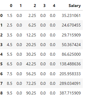
data_with_poly = polynomial.fit_transform(X)
# Polynomial transformation results in Numpy array. Need to convert back to dataframe
data_with_poly = pd.DataFrame(data_with_polynomial)
data_with_poly["Salary"] = y
# Let's create X and Y again for the poly-based model
X = data_with_poly.drop("Salary", axis=1)
y = data_with_poly["Salary"]
# Let's fit this to Linear Model
model_with_poly = LinearRegression().fit(X, y)
# Only X values
new_data_without_poly = pd.read_csv("PolynomialRegression2.csv")
# Run polynomial fit and transform to add sqaured features to X
new_data_with_poly = polynomial.fit_transform(new_data_without_poly)
new_data_with_poly
# Polynomial transformation results in Numpy array. Need to convert back to dataframe
new_data_with_poly = pd.DataFrame(new_data_with_poly)
# Now here is the prediction
new_data_with_poly["Salary"] = model_with_poly.predict(new_data_with_poly)
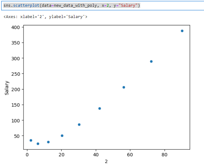
sns.scatterplot(data=new_data_with_poly, x=2, y="Salary")Here is the plot of the squared variable. Notice how this model is starting to show a little more curvature.
Lastly, here are the predictions based on this
We can try this at higher degree polynomials as well to see if that is any better. Later on, I will provide you with more statistical ways to see if these are good models.
¶ Time Series
There may be situations when you want to predict time series data such as the price of a stock or track inflation, store sales, etc. These situations typically follow a cyclical nature in some sense. What happens in the past is not always an indication of what will happen in the future so there is some guess-work but the key is to get historical data through a supervised method, train a model, and then see how accurate the model is.
¶ Logistic Regression
¶ Classification
¶ Multi-Classification
¶ Clustering